


Power BI - Power Business Intelligence
Microsoft Power BI is a collection of software services, apps, and connectors that work together to turn your unrelated sources of data into coherent, visually immersive, and interactive insights. From data in a simple Microsoft Excel workbook, or a collection of cloud-based and on-premises hybrid data warehouses, Power BI lets you easily connect to your data sources, clean, and model your data without affecting the underlying source, visualize (or discover) what's important, and share that with anyone or everyone you want.
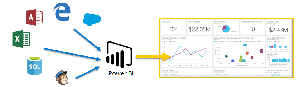
Power BI consists of a Microsoft Windows desktop application called Power BI Desktop, an online SaaS (Software as a Service) service called the Power BI service, and mobile Power BI apps that are available on phones and tablets.
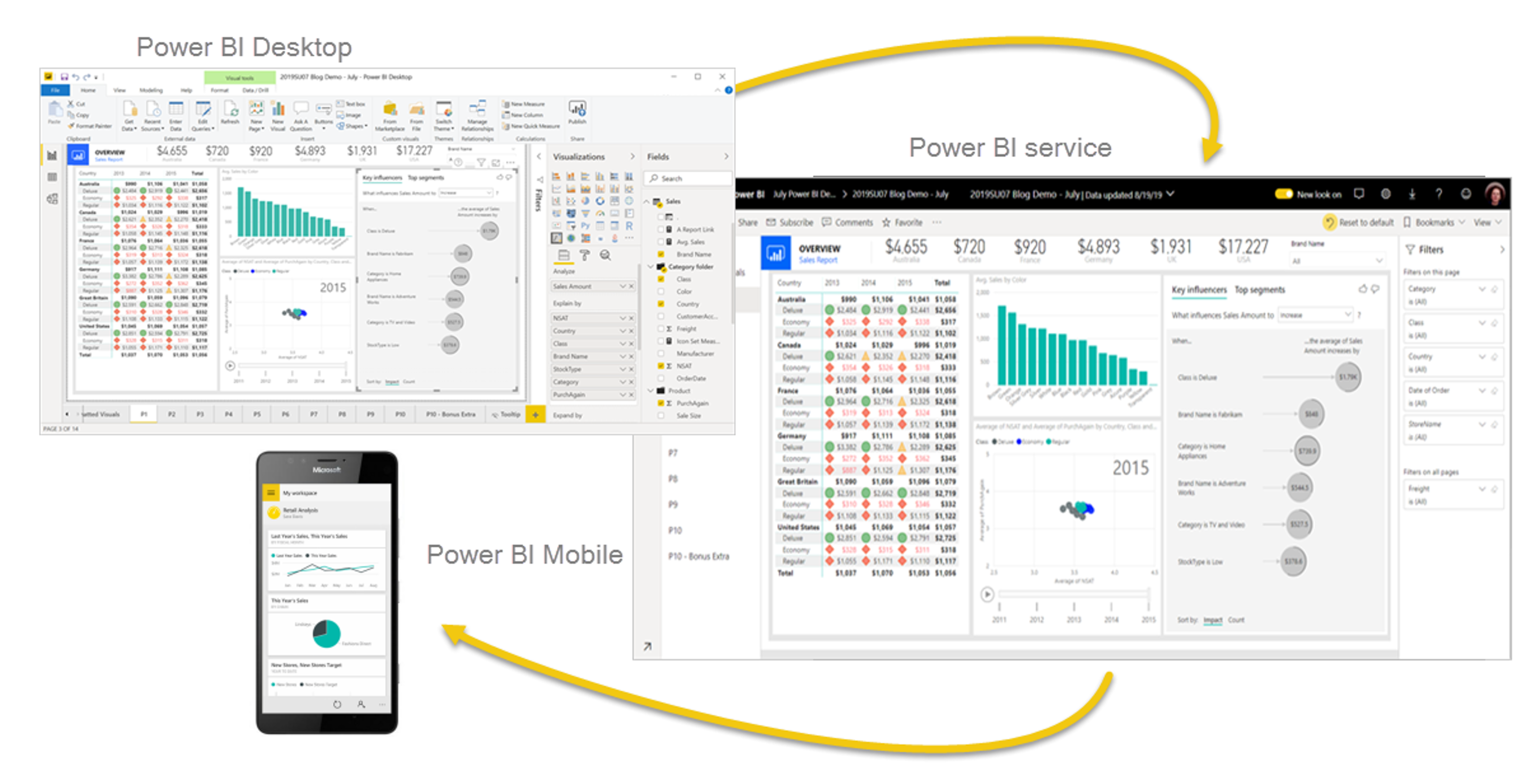
These three elements, Power BI Desktop, Power BI Service, and Power BI Mobile apps are designed to let people create, share, and consume business insights in the way that serves them, or their role, most effectively.
Explore the different Power BI elements
To create Power BI Solutions, there are several major building blocks. These elements help not only what data is being presented, but also how it appears to those users who are consuming it. Those elements are datasets, reports, and dashboards. All elements are organized into workspaces, and they're created on capacities.
Capacities
Capacities are a core Power BI concept representing a set of resources used to host and deliver your Power BI content. Capacities are either shared or dedicated. A shared capacity is shared with other Microsoft customers, while a dedicated capacity is fully committed to a single customer. Dedicated capacities require a subscription. By default, workspaces are created on a shared capacity.
Workspaces
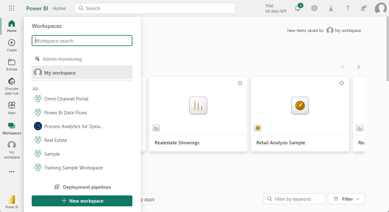
Workspaces are containers for dashboards, reports, datasets, and dataflows in Power BI. There are two types of workspaces: My workspace and workspaces.
My workspace is the personal workspace for any Power BI customer to work with your own content. Only you have access to your My workspace. You can share dashboards and reports from your My Workspace. If you want to collaborate on dashboards and reports or create an app, then you want to work in a workspace.
Workspaces are used to collaborate and share content with colleagues. You can add colleagues to your workspaces and collaborate on dashboards, reports, and datasets. With one exception, all workspace members need Power BI Pro licenses.
Workspaces are also the places where you create, publish, and manage apps for your organization. Think of workspaces as staging areas and containers for the content that makes up a Power BI app. So, what is an app? An app is a collection of dashboards and reports built to deliver key metrics to the Power BI consumers in your organization. Apps are interactive, but consumers can't edit them. App consumers, colleagues who have access to the apps, don't necessarily need Pro licenses.
Semantic models
A semantic model is a collection of data that you import or connect to. Power BI lets you connect to and import all sorts of semantic models and bring all of them together in one place. Semantic models can also source data from dataflows.
Semantic models are associated with workspaces and a single semantic model can be part of multiple workspaces. When you open a workspace, the associated semantic models are listed under the semantic models tab. Each listed semantic model represents a collection of data. For example, a semantic model can contain data from an Excel workbook on OneDrive, an on-premises SSAS tabular semantic model, and/or a Salesforce semantic model. There are different data sources supported. Semantic models added by one workspace member are available to the other workspace members with an admin, member, or contributor role.
Shared semantic models
Business intelligence is a collaborative activity. It's important to establish standardized semantic models that can be the 'one source of truth.' Discovering and reusing those standardized semantic models is key. When expert data modelers in your organization create and share optimized semantic models, report creators can start with those semantic models to build accurate reports. Your organization can have consistent data for making decisions, and a healthy data culture. To consume these shared semantic models, just choose Power BI semantic models when creating your Power BI report.
Reports
A Power BI report is one or more pages of visualizations such as line charts, maps, and other elements. You can create reports in Power BI from scratch, import them from shared dashboards, or have Power BI generate them when connecting to datasets. For example, when you connect to an Excel workbook that contains Power View sheets, Power BI creates a report based on those sheets. And when you connect to a SaaS application, Power BI imports a prebuilt report.
There are two modes to view and interact with reports:
Reading view: When a report is opened by a user, it's displayed in reading view.
Editing view: For individuals that have edit permissions, editing view is used to modify the different elements on the report and how they're presented.
When a workspace is opened, associated reports are listed under the Reports tab. Each listed report represents one or more pages of visualizations based on only one of the underlying datasets. To open a report, select it.
When you open an app, you're presented with a dashboard. To access an underlying report, select a dashboard tile (more on tiles later) that was pinned from a report. Keep in mind that not all tiles are pinned from reports, so you may have to click a few tiles to find a report.
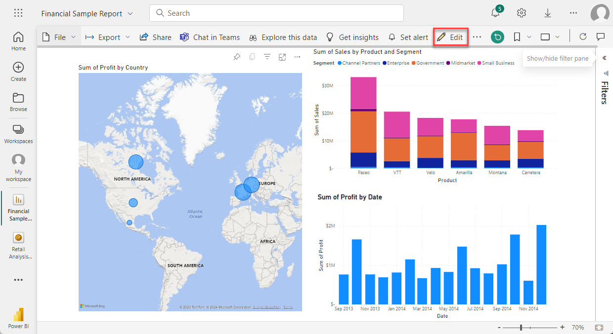
By default, the report opens in Reading view. Just select Edit report to open it in Editing view (if you have the necessary permissions).
Dashboards
A dashboard is a single canvas that contains zero or more tiles and widgets. Each tile pinned from a report or from Q&A displays a single visualization that was created from a dataset and pinned to the dashboard. Entire report pages can also be pinned to a dashboard as a single tile. There are many ways to add tiles to your dashboard, too many to be covered in this overview topic.
Why do people create dashboards? Here are just some of the reasons:
To see all information needed to make decisions in one glance.
To monitor the most important information about your business.
To ensure all colleagues are on the same page, viewing and using the same information.
To monitor the health of a business, product, business unit, or marketing campaign, etc.
To create a personalized view of a larger dashboard and show all the metrics that matter to them.
When you open a workspace, the associated dashboards are listed under the Dashboards tab. To open a dashboard, select it. When you open an app, you are presented with a dashboard. If you own the dashboard, you also have edit access to the underlying dataset(s) and reports. If the dashboard was shared with you, you are able to interact with the dashboard and any underlying reports but won't be able to save any changes.
Template Apps
Power BI template apps enable Power BI partners to build Power BI apps with little or no coding and deploy them to any Power BI customer. As a Power BI partner, you create a set of out-of-the-box content for your customers and publish it yourself.
You can build template apps that allow your customers to connect within their own accounts. As domain experts, they can unlock the data in a way that is easy for their business users to consume.
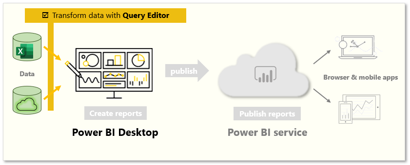
Describe cleaning and transforming data in Power BI Desktop
When working with data from different data sources, it's not always going to be in a format that allows it to be displayed with other data. For example, you might be getting ready to build a device usage report that display IoT related device details for individual customers. Typically, that data exists in multiple systems. The customer details likely are in your organization's Customer Relationship Management (CRM) system, while the IoT data is likely stored in a dedicated IoT system such as Azure IoT Hub. Many times, the IoT data isn't structured as nicely as the data in your CRM system. Some of the data may not be in the right format, or there might just be more data than you need. In these instances, you need to clean and transform your data. Cleaning and transforming data is how you prepare your data and get it ready to be used. To begin transforming and cleaning data, you use the Power BI Desktop application.
Power BI Desktop has three views:
Report view: You can create queries to build compelling visualizations that you can share with others. You can arrange them as you want them to appear.
Data view: See the data in your report in data model format, where you can add measures, create new columns, and manage relationships.
Model view: Get a graphical representation of the relationships that are established in your data model and manage or modify them as needed.
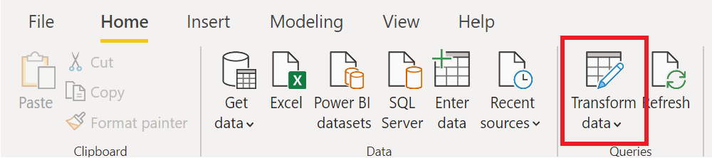
Power BI Desktop includes the Power Query Editor tool, which can help you shape and transform data so that it's ready for your models and visualizations.
To begin, select Edit from the Navigator window to launch Power Query Editor. You can also launch Power Query Editor directly from Power BI Desktop by using the Transform Data button on the Home ribbon.
Transforming data
As mentioned previously, transforming data is the process of putting data into a format that is useable in your reports. Examples of the available transformations include removing a column from the table, duplicating the column under a new name, or replacing values.
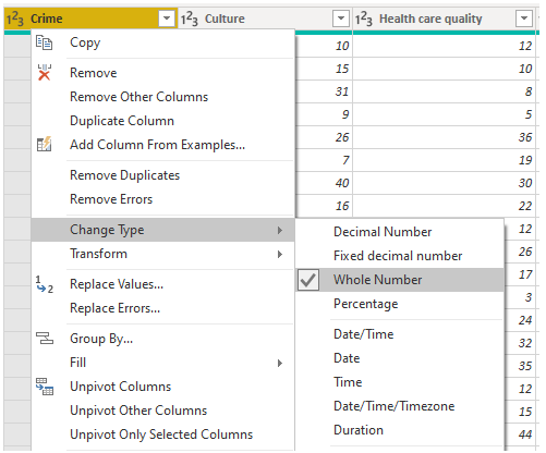
Clean data
While Power BI can import your data from almost any source, its visualization and modeling tools work best with columnar data. Sometimes, your data isn't formatted in simple columns, which is often the case with Excel spreadsheets.
A table layout that looks good to the human eye might not be optimal for automated queries. For example, the following spreadsheet has headers that span multiple columns.
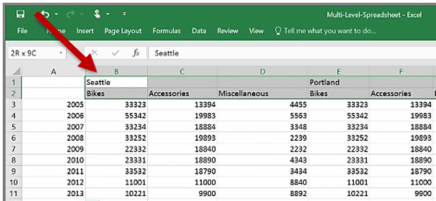
When you clean data, you might combine those rows into a single item to better format the data to fit your needs. Or you may have a series of numeric data that would need to be aggregated to display better. With Power Query, there are a series of tools that you can use to prepare the data.
Describe using AI Insights to spot trends and anomalies
One challenge that organizations have, is being able to easily identify trends and detect anomalies as they occur. For example, many retail organizations see an increase in sales during the month of December over the holiday season. This uptick in sales is expected, but what happens if sales were down during that month, or if they were higher in August than normal? It's important to identify these anomalies as quickly as possible so you can take the necessary action.
Power BI’s insights feature helps organizations easily identify insights such as anomalies and trends in your data as you interact and consume elements such as reports, dashboards, and visualizations. It notifies you if there are interesting insights and provides explanations for them. It works out-of-the-box on any report, so you can automatically start getting insights from your reports without any setup.
Power BI has multiple insights features that use artificial intelligence (AI):
Insights for reports: Analyzes data and finds anomalies and trends in your data as you interact with reports.
Insights for individual visuals: Analyzes and explains the fluctuations of data points in visuals.
Insights for dashboard tiles: Looks at the data being used to render that tile and presents them in interactive visuals.
Quick Insights for datasets: Automatically generate data insights on a dataset in the Power BI service.
AI Insights for data models in Power Query: Provide access to pretrained machine learning models from Azure Cognitive Services.
Notifications
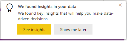
Notifications are an important part of the Insights capabilities in Power BI. As you're working on Power BI elements such as reports, Power BI automatically runs insights analysis. When Power BI identifies insights, you're presented with a notification. You can choose to either see the insights or ignore them. Notifications are a great way to proactively interact with suggested insights to ensure that you're not missing anything important such as if sales in a specific region increased. Top insights are those insights that are noteworthy, based on factors like recency and significance of the trend or anomaly.
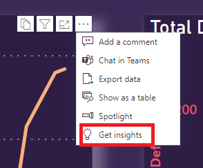
Get insights on reports and visuals
The notification capabilities alert and notify you of insights as you're working on reports. There are also many scenarios where you may just be able to get insights as you walk through some of the different elements. As you're working with Power BI reports and visuals, you can select Get insights to open the Insights pane.

The pane only shows insights about the current report page, and it updates when you select a different page on the report. As you work with individual visualizations, you can select More options (...) in the upper-right corner of a visual, and then Get insights to see insights about just that visual.
Insights
The Insights pane currently shows three types of insights:
Anomalies: Represents something that is out of the ordinary from what is expected. For example, a smart thermostat that suddenly reads the temperature as 100 F when it's typically 72 F would be considered an anomaly.
Trends: Represents a pattern that is found in time-series datasets. For example, if a company’s sales are steadily increasing through the month of April that would represent a trend.
Key Performance Indicator (KPI) analysis: Helps you evaluate the current value against a defined target. For example, a company might set a sales goal at 1.2 million, but currently they are at 1 million.
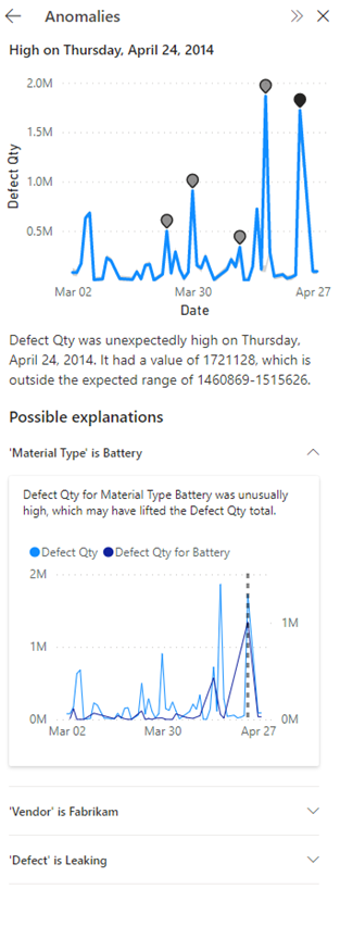
Anomalies
An anomaly is an abnormality in time-series data, such as unexpected spikes and dips in the data. An algorithm computes a boundary around what is considered a normal or expected value. Any value found outside this boundary is marked as an anomaly.
There are three types of anomaly insights:
Significant anomaly: The anomaly has a high score. Anomaly score indicates how far the point is from the expected range.
Recent anomaly: The most recent anomaly in the measure.
Anomaly summary: This insight type summarizes multiple anomalies in the measure.
When an anomaly in your data is flagged, Power BI runs an analysis across the different dimensions in your data model to look for spikes or dips in the measure that correlates to the anomaly. They're shown as possible explanations ranked by strength.
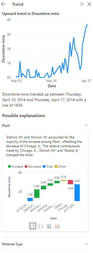
Trends
A trend occurs when there's a prolonged increase or decrease in time-series data. There are a series of steps the Power BI algorithm uses to find meaningful trends. It first performs data smoothening, interpolation, and time-series sampling. The trends are then identified for statistical significance based on the slope and length of a change in value. The algorithm removes noise like seasonality and outliers. For example, if sales jump in December, the algorithm doesn't mark that as a noteworthy trend because it's common for sales to jump around the holidays.
There are four main trends flagged:
Long trend: The trend is significant and is the longest trend within a single series or across multiple series in a visual.
Steep trend: The trend is significant and is the steepest trend within a single series or across multiple series in a visual.
Recent trend: The trend is significant and is the most recent trend within a single series or across multiple series in a visual.
Trend reversal: Recent trend in a single series or across multiple series in a visual where the reversal is significant, compared to the previous trend segment.
When a trend in your data is flagged, Power BI looks for and identifies the categories that most influenced the increase or decrease in the identified trend. Possible explanations are ranked based on the relative contributions from different categories to the increase or decrease in trend.
KPI analysis
KPI analysis with a target looks at the variance of the current value to its target. It's considered significant if the variance is high or low compared to other segments. KPI analysis without a target looks at the value itself and flags ones that are high or low compared to other segments.
For KPI analysis explanations, Power BI looks for and identifies the categories that have higher or lower than anticipated values. For KPI analysis with target, possible explanations are ranked based on Z-scores of the difference of the value from the target. Whereas for KPI analysis without a target, possible explanations are ranked based on the Z-scores of the value itself.
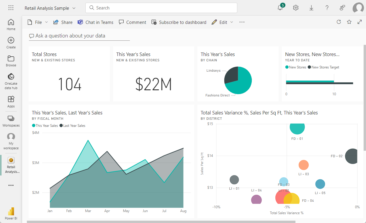
Build a basic dashboard
Now that we introduced you to some of the core concepts in Power BI such as reports, dashboards, and workspaces, let’s see how these different elements would be used to support common business scenario. Managers often want to see how their salespeople are performing. It wouldn't be uncommon for your manager to ask to see your latest sales and profit figures by the end of the day. Many individuals keep those details in an Excel spreadsheet on their computer. Historically, getting that data into a format that a manager can easily consume could take several hours if not days.
With Power BI, we can easily create and share a dashboard with a manager by connecting to a data source such as an Excel spreadsheet on your laptop. While the data sources that you use might be different, the process for building and sharing a dashboard are same.
You need to take the following steps:
Prepare your data: Preparing the data ensures that it's in a format that Power BI can easily consume.
Build a report: The report contains the visuals that you want to include in your dashboard. Depending on the scenario, reports can be built in either Power BI Desktop or using the Power BI Service.
Pin the report visuals to a dashboard: Dashboards are the primary element that users use for viewing data. They can include data from multiple reports as needed.
Share a link to the dashboard: Any users with the link and the necessary permissions are easily able to view and interact with the data.
Prepare the data
The first thing you need to do is ensure that your data is ready to be consumed. Depending on the data source and the volume of data you're working with, you may need to do some data cleansing and transforming using Power Query. If you are connecting to an Excel spreadsheet, make sure the data is in a flat table, and that each column contains the right data type. For example, text, date, number, or currency. It's also important that you have a header row but no columns or rows that display totals. Total operations are handled in Power BI as we create the visuals.
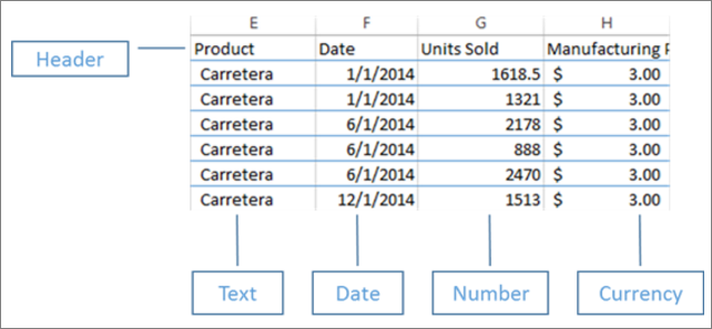
You can see that there's a header column, and each column has the correct data type associated with the data.
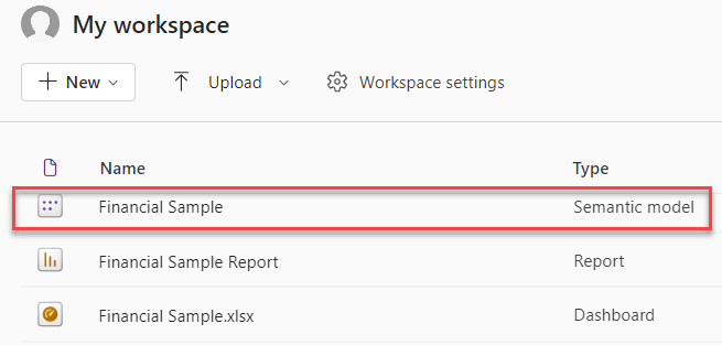
Upload your data to the Power BI service
The Power BI service is where you're able to create reports that connect to your data sources. This includes Excel files that live on your computer. With a few simple clicks, you can attach to a dataset, and Power BI creates a blank dashboard where you're able to place visuals later.
In the image, we attached to sample financial data. It shows the completed Financial Sample dataset, and the blank dashboard.
Build your report
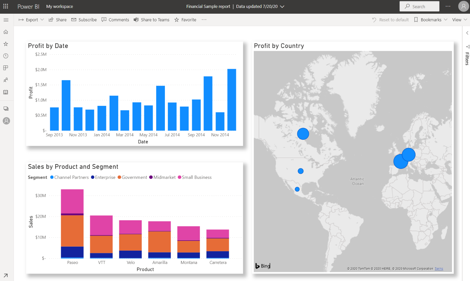
Once you connected to your data, you can either create a new report or edit an existing report that was created previously. Then we can begin editing the report by using the editing view. On the right are the Visualizations, Filters, and Fields panes. Your Excel workbook table data appears in the Fields pane. At the top is the name of the table, financials. Under that, Power BI lists the column headings as individual fields.
Different visualizations are available that you can use to display the data in your report. Different visualizations can be added to the report based on the data that you want to communicate. In the image, multiple bar charts are being used to showcase the number of units being sold. Additionally, map control is included to show sales volumes per country/region.

Each visualization includes a series of filters and controls that can be used to impact how the data is being presented. For example, if you want to change the sum of units sold to display profit by date, you could switch the Y-axis from Sum of Units sold, to Sum of Profit.
More visualizations are being added to Power BI to reflect how business is being done. For example, there's a Power Apps visualization that lets you build a canvas app directly in your Power BI report, which is connected to the Power BI data set. As people interact with the data, the data in the Power App changes. For example, you could create a canvas app that includes actions such as sending emails or scheduling meetings. As you drill down on a Power BI report, you identify customers we haven't talked to in a while. The embedded canvas app lets us initiate actions, such as sending an email, right from the Power BI report.
Pin to a dashboard
After you have all your visualizations on your reports, you can build your dashboard. Dashboards are easy to build because you're just determining which visuals from your created reports you want to include.
In the image, we're taking the Profit by Date visualization and pinning it to a dashboard.
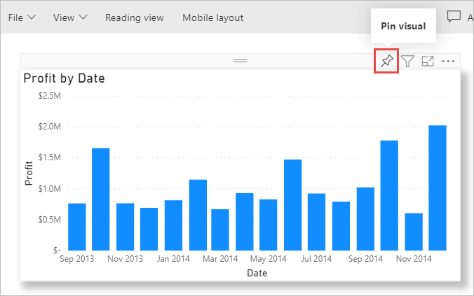
Since dashboards can have visuals from multiple reports, it makes it easy to have detailed dashboards that include data from multiple data sources, even if some of those data sources might be unrelated.
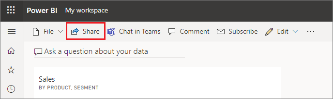
Share a link to your dashboard
Initially dashboards that you create are only visible to the person that created them. However, Power BI makes it simple to share dashboards with other individuals. You can share your dashboard and underlying report with any colleague who has a Power BI account. They can interact with it, but they can't save changes. If you allow it, they can reshare with others or build a new report based on the underlying dataset.
Now that we talked about the process of building a dashboard using Power BI, let’s see the process in action.